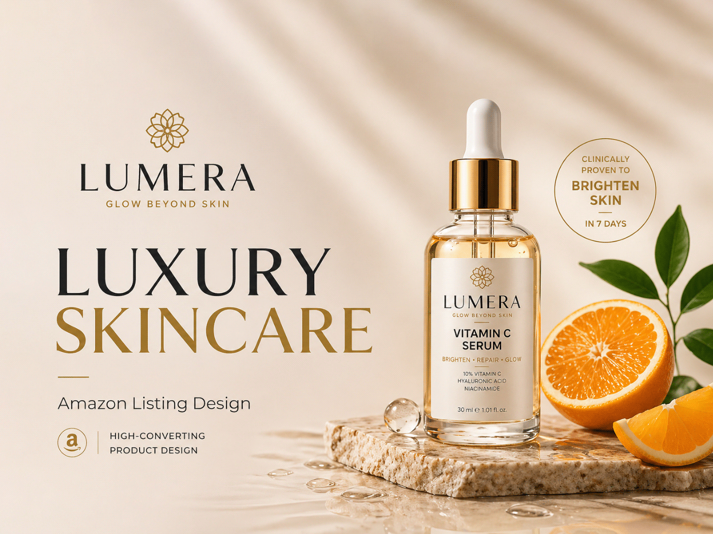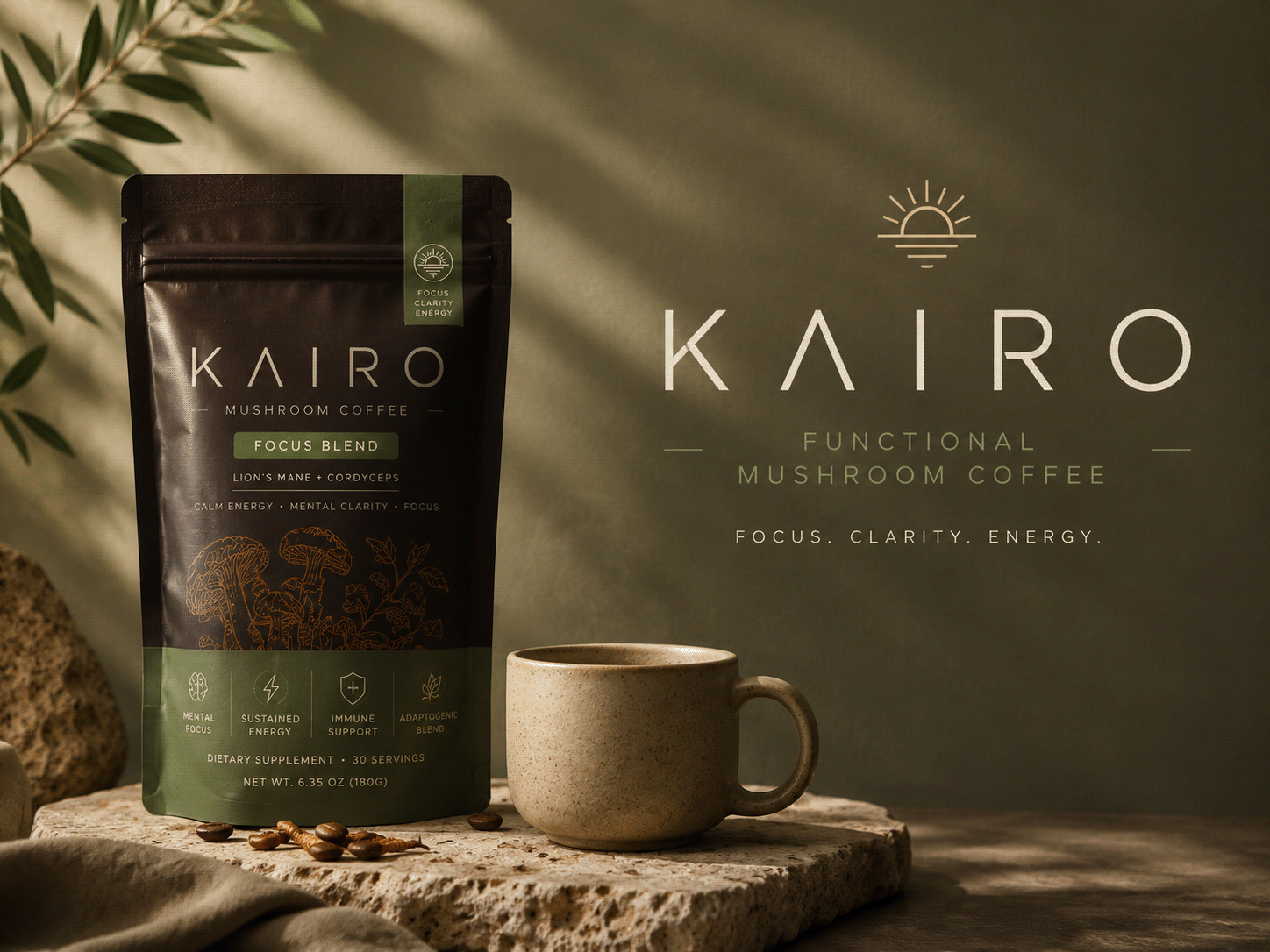
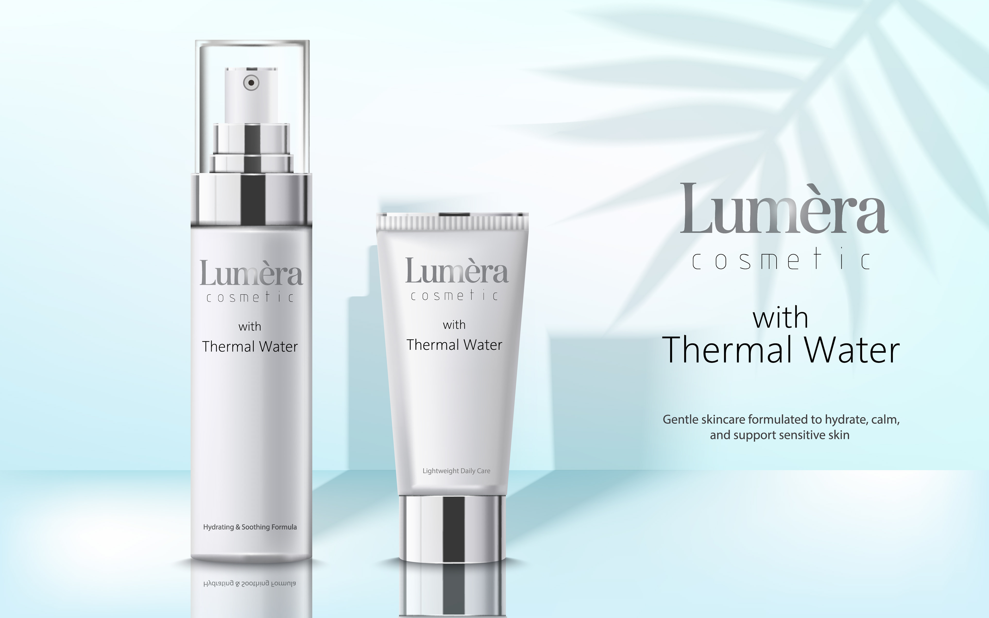
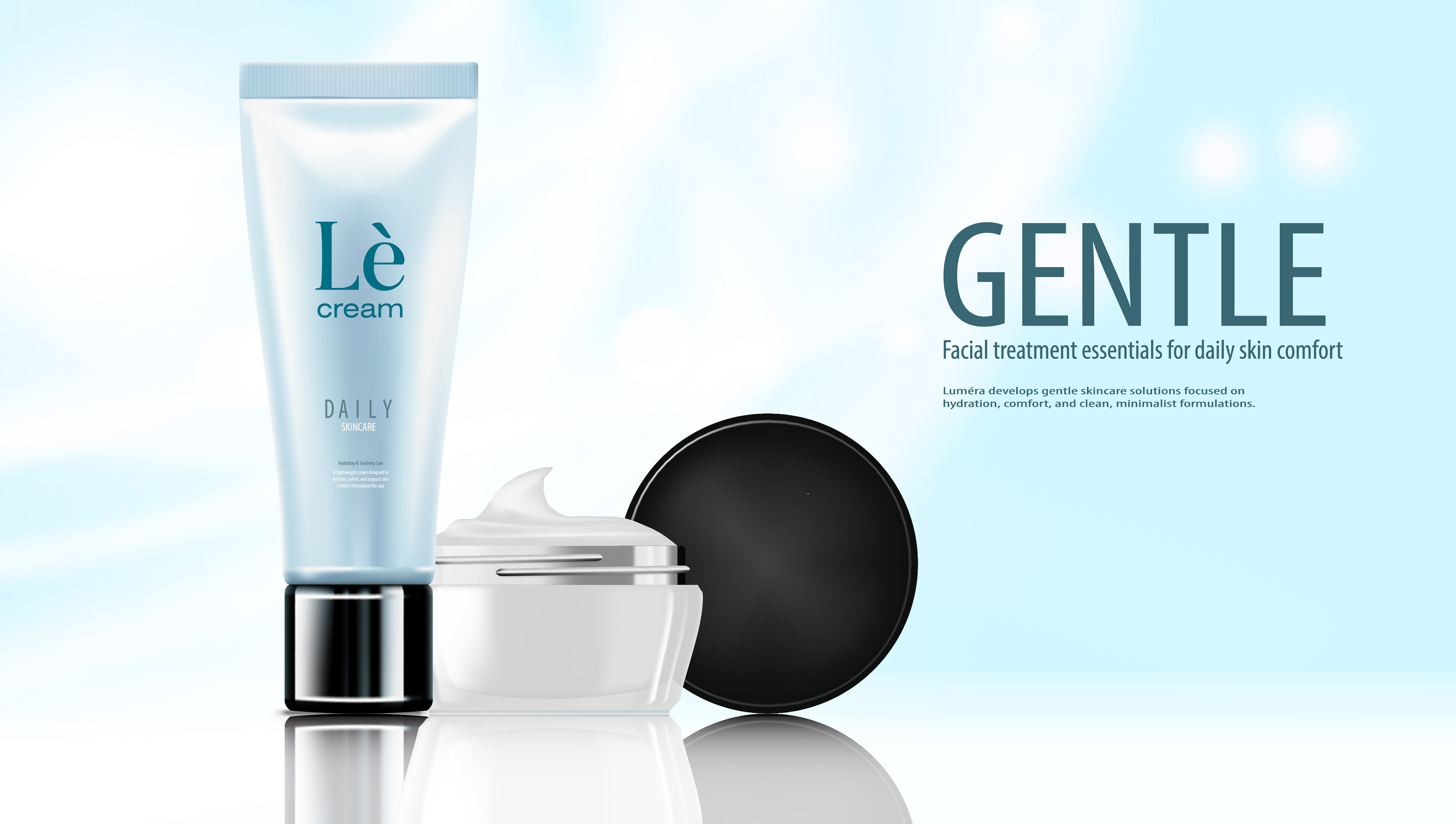
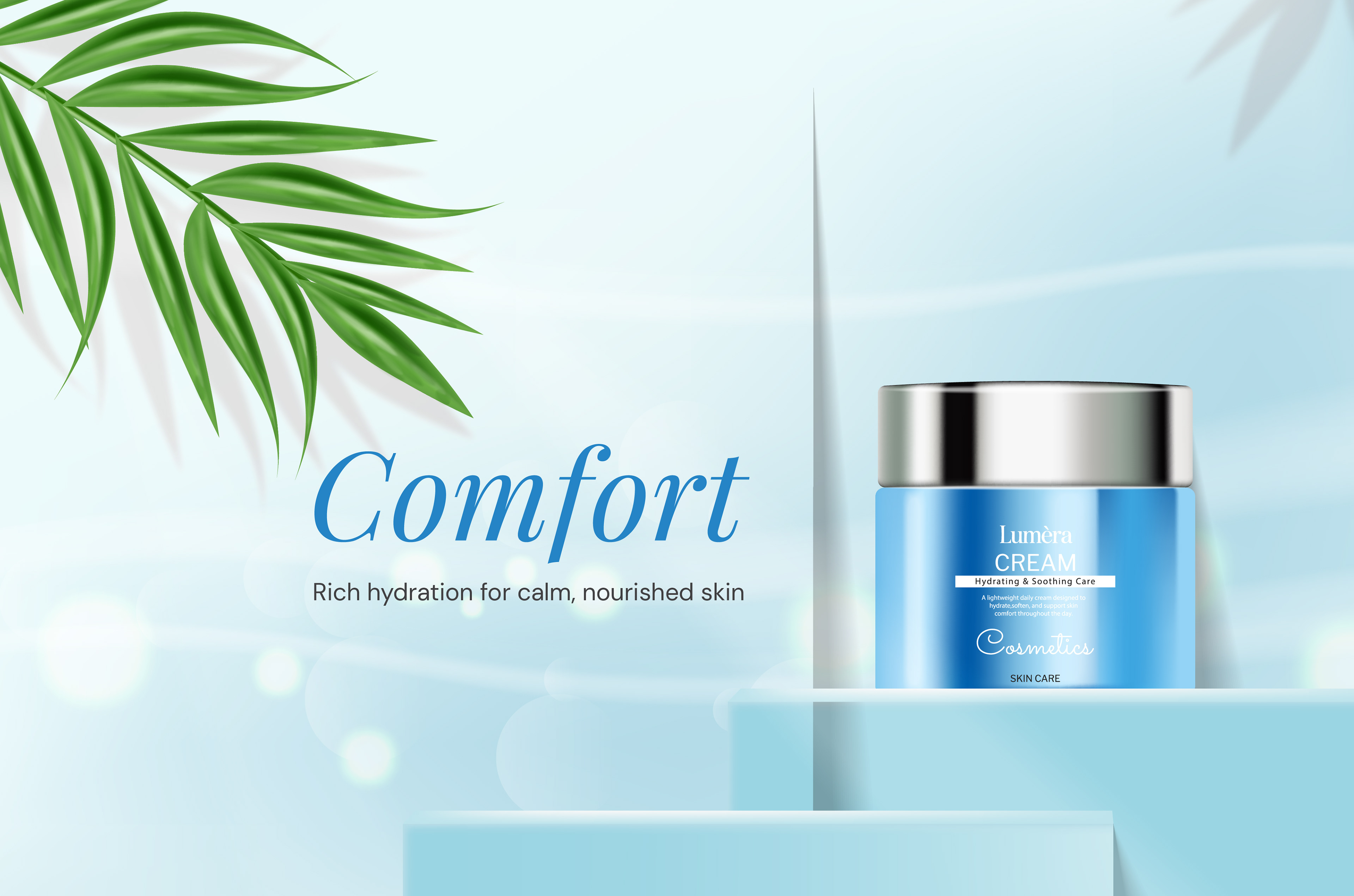
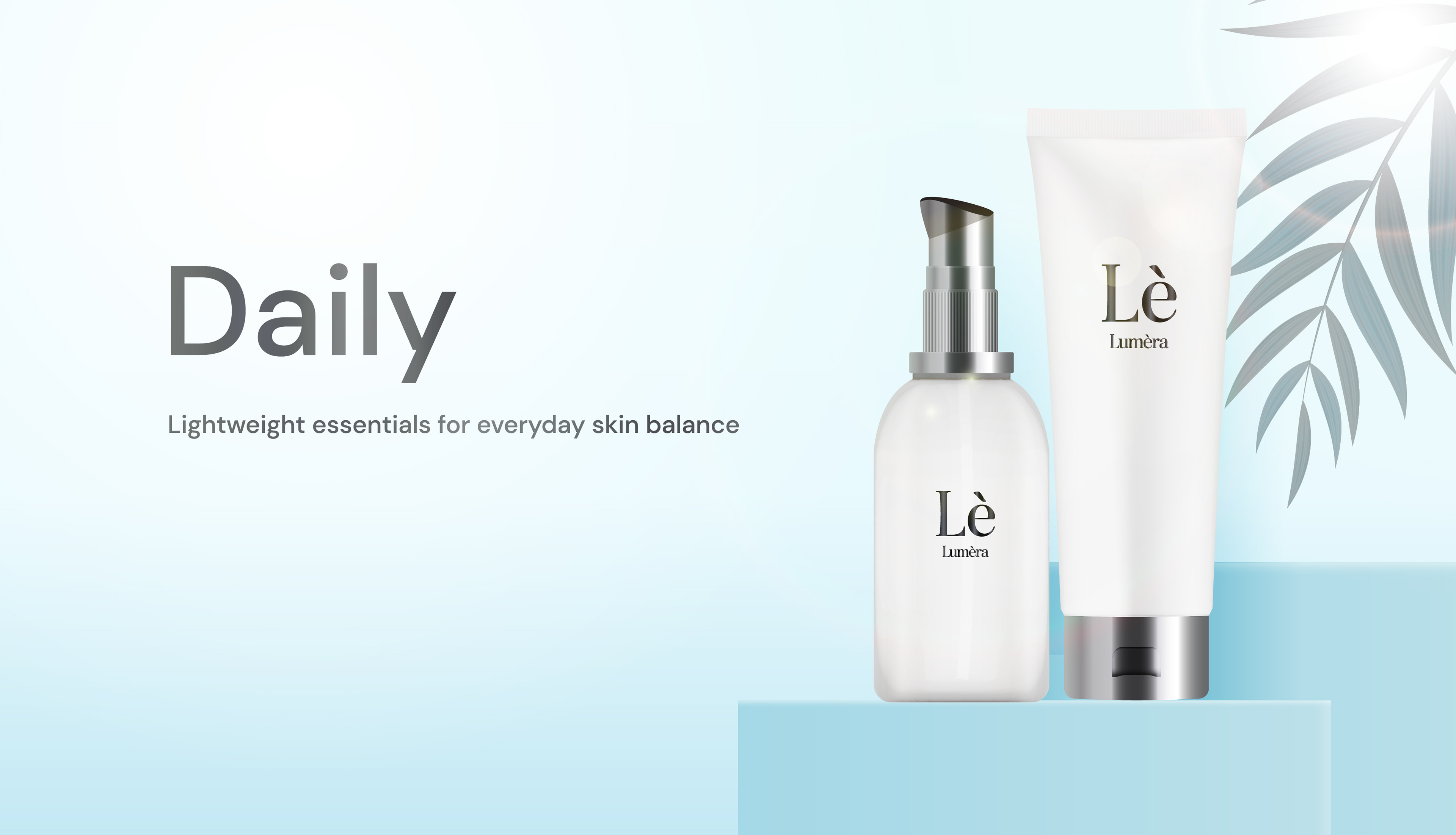
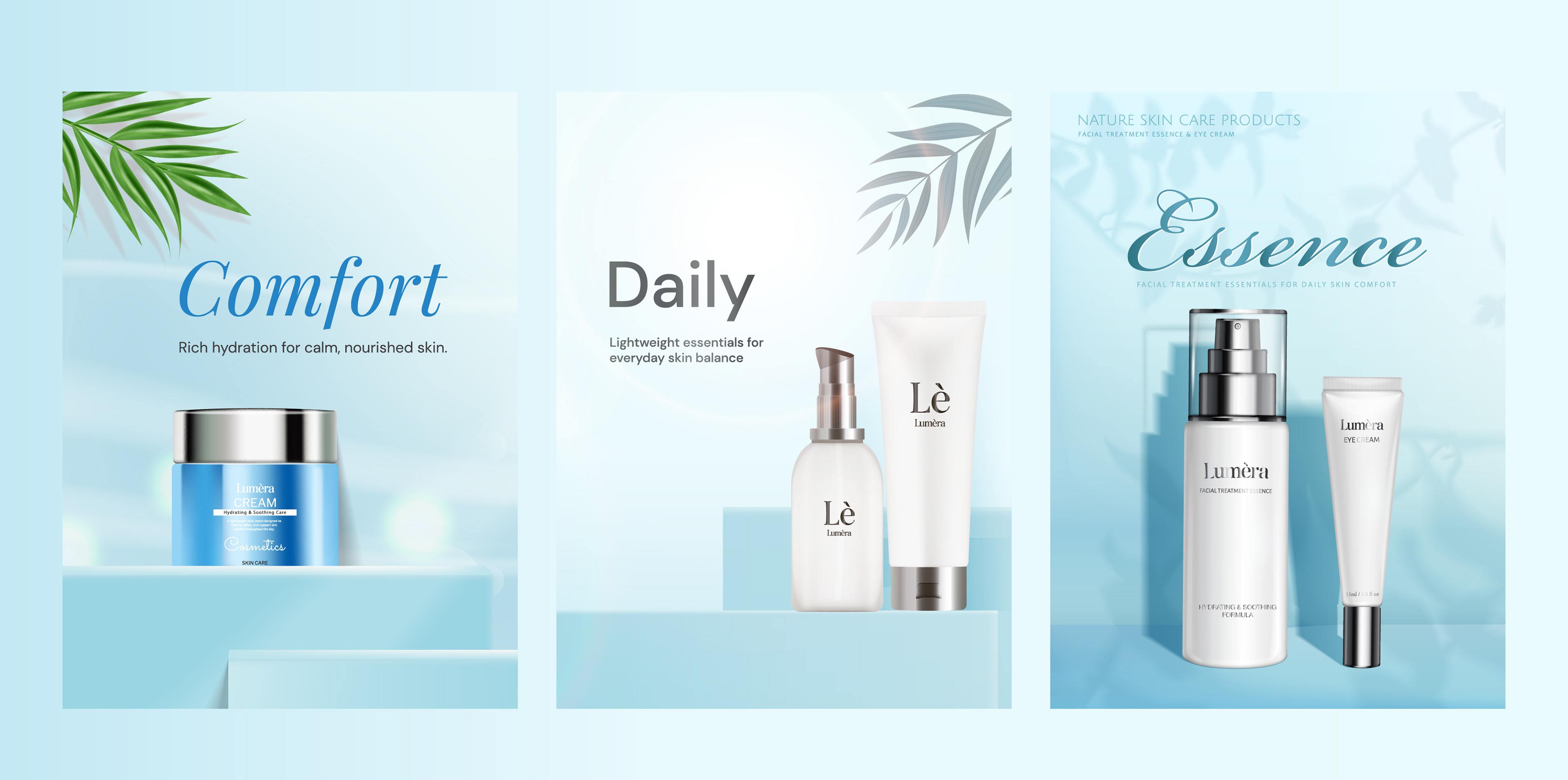
Hero Banner Foundations
Hero banners designed as modular components, allowing the same visual system to communicate brand emotion, daily care, and product-focused messaging.
Versatility
• Adaptable headlines for emotional, functional, and product-focused messaging.
• Consistent layouts emphasizing product photography.
• Neutral, calming backgrounds.
• Consistent layouts emphasizing product photography.
• Neutral, calming backgrounds.
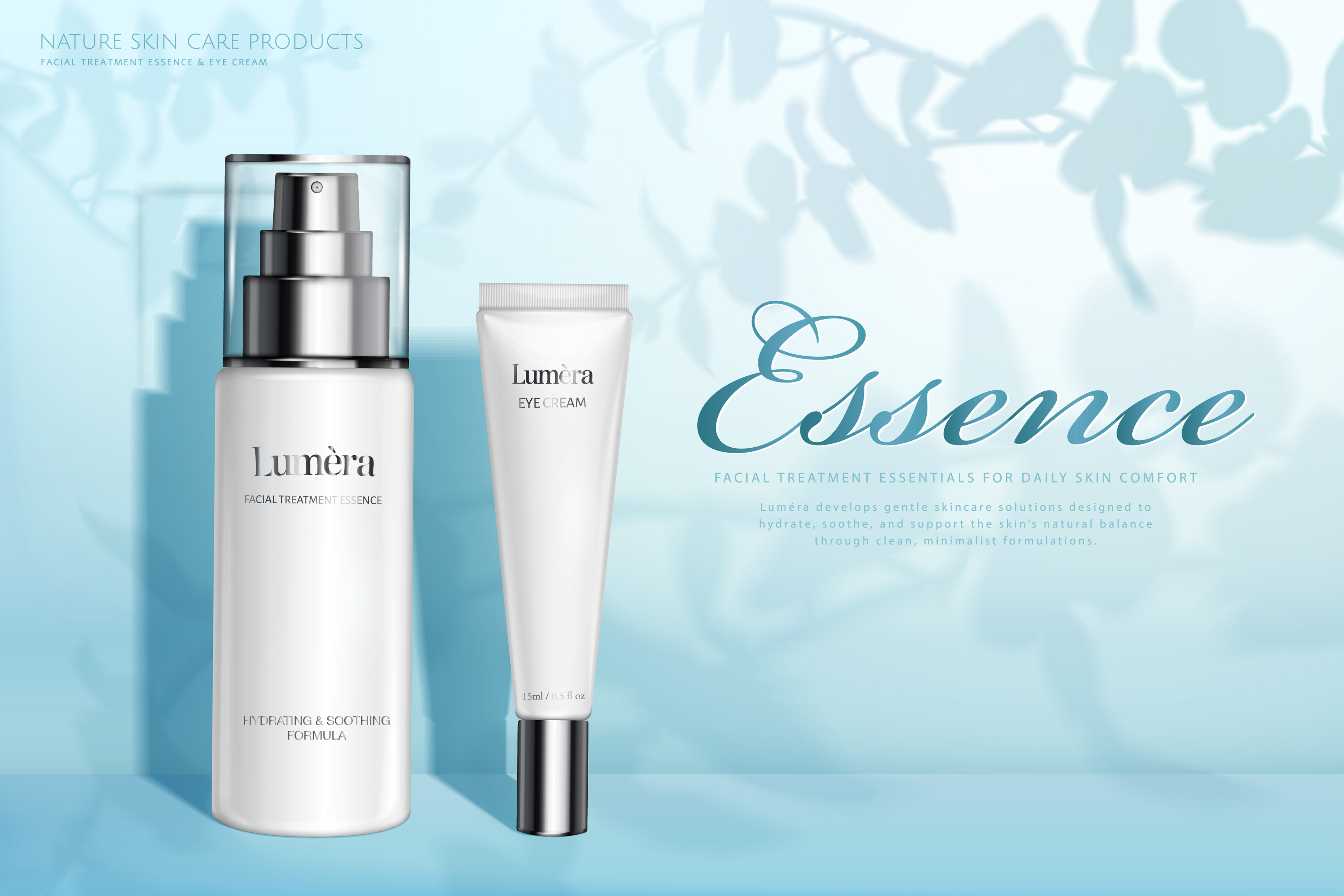
Cohesiveness
• Shared color palette and typography across all banners.
• Consistent visual balance with hierarchy of headline and supporting text.
• Soft botanical elements to suggest natural ingredients.
• Consistent visual balance with hierarchy of headline and supporting text.
• Soft botanical elements to suggest natural ingredients.
Design System
A cohesive visual system designed for an elegant and calming skincare brand.
A harmonious blend of typography and color to communicate both brand emotion and product clarity.
A harmonious blend of typography and color to communicate both brand emotion and product clarity.
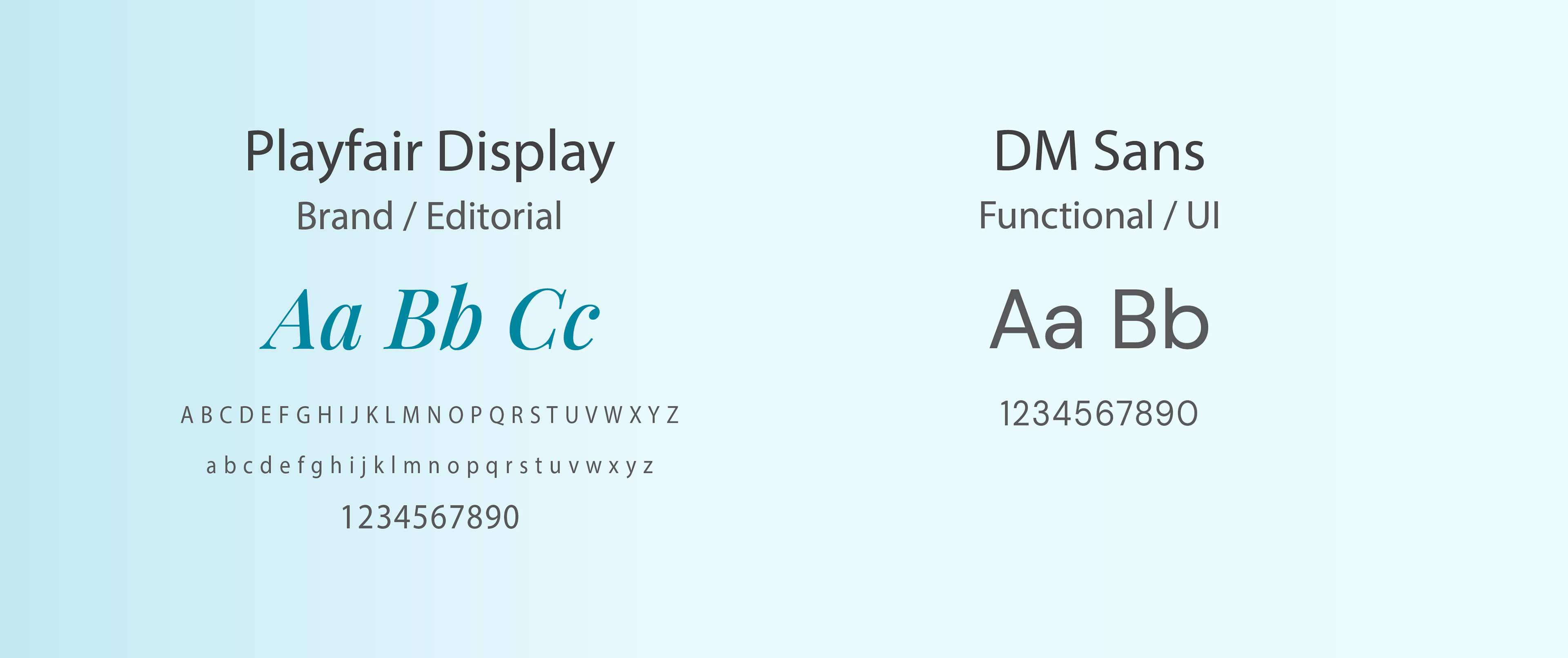
Typography System
A combination of an editorial serif and a clean sans-serif was used to balance emotional brand expression with functional clarity.
Color Palette
A calm and minimal color palette inspired by water, clean formulations, and natural skincare ingredients.
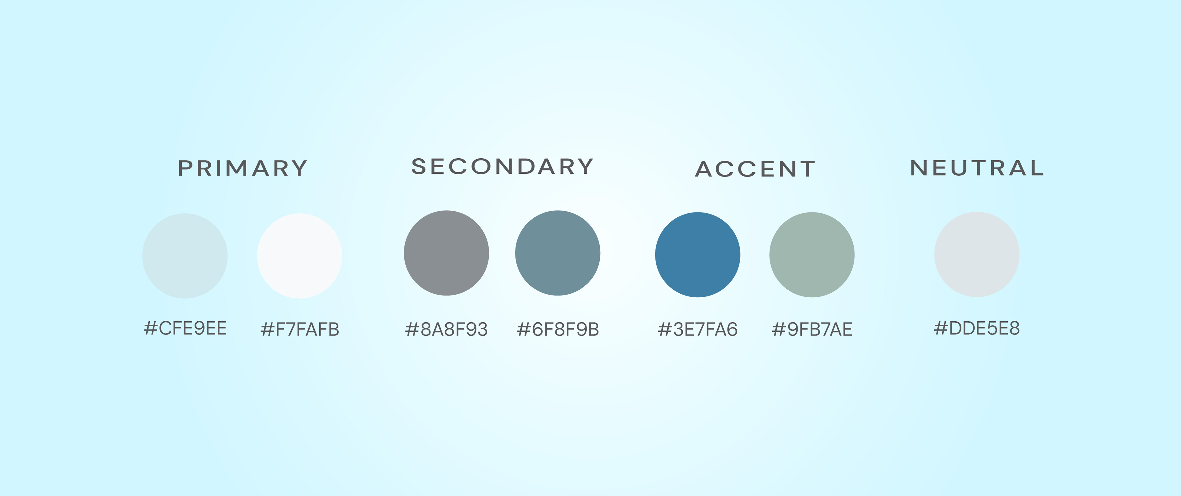
Primary colors define the brand’s calm visual base, while accent tones highlight products
and natural ingredients.